Wednesday, 12 March 2014

Best Brands and Brand Names

We live in a world where almost everyone want to start their own businesses and brands because of the fact that people these days just do not see the purpose of working for someone else and coming with ideas which will make money for their employers instead of doing something which will benefit them by making that money for themselves. Well the thing is we all have the freedom and ideas to bring our names forward and even in the highest earning Forbes list if we are lucky enough to have all the odds in our favour,  something that stands in the way between us and achieving that success is that we all want to see ourselves there, what I am trying to say is that there will be people which will be always better at something you think you are good at and what you will envy is that some do it without even trying their best. Therefore one may have the best looking logo but it will always be a company out there which will have consumers lining up for their branded products even though your company offer an alternative and has a more meaningful name than the other. People often take care, personalize and put their names on the belongings which they feel good about, companies also has a way of showing that some products are offered by them and they do so by branding. Back in the 1950's Thomas Watson said "Good design is good business" and even today we can see people wanting to buy products owned by certain companies for the fact that those companies put a lot of money at markerting their brands in the most creative and entertaining way as possible.  The following are some brands which I as a graphic designer find very thought-through, elegant and having the ability to belong to any time period that is to come in the future.

figure 1

Adidas has been a brand which has recreations of their logo for long and yet all these logos are known to represent one company. The logo consists of three stripes in all the reproduction of it, what I have realized though is that the typeface used on the logo has never changed and it is also the main thing which causes people to recognize the brand even when it has different logos, so I would like to put the brand to the test by using just the typeface of the brand but in capital letters with the first "D" of the word facing the opposite way vertically in order to put emphasize of the three stripes as lines which go through the two "D"s and "I" to reproduce the three stripes but in a vertical stance.

figure 2

figure 3

Although there are words that the Blackberry company is doing bad at the moment because of Android, Iphone and Windows Phone giving it a tough competition in the smartphone world, I have to say that the above logo and name(figure 2  and figure 3) that RIM(Research In Motion) presented us with is one of a kind and is complemented by it logo for the fact that a blackberry fruit looks the same way and how their phones are produced with a beveled look and qwerty keyboard buttons also shows that the company put a lot of designing to achieve such. Figure 4 and figure 5 below shows how the B's of the name can be manipulated to make the logo. I do not think I would have 

figure 4

figure 5


Okay we now that we have seen about two of some of the best contemporary brands ever made in the history of conceptual corporate identity, now is time to see which is the third, I would like to bring forward that I did not know which one is best between the two so I picked them both to run in third place even though these are not brands are not against each other in any way (meaning there is no number one, two or three)and they are all good in different levels, Figure 6 is Firefox, the thing about this company is how they manipulated their logo to look like a fox which tail is fire seeming to run around the world, this internet launcher company presents how it is reliable in speed with just their logo, with respect I would not get an idea to better this if ever I am asked. Another is a Linux company using the South African philosophy of Ubuntu, which simply means "a person is a person through other people" and it is an open source computer software which means it can be downloaded or used for free without committing any fraud against the licenses as long as you do not sell it to others. Ubuntu uses a circle for their logo with outside smaller circles and if one looks closely they would see that it is actually three people holding hands in a circle, I would offer much change  to this as well but putting the small circular heads in align with something would do well for the logo and also make it easier for those who get fun in drawing or reproducing logos applying mathematics.

figure 6

figure 7


Tuesday, 11 March 2014

Content and Style of Magazines; A Look Beyond the Words and Pictures

Now one would ask themselves why are hardcopy magazines still being produced and published in these contemporary times because the ideas of saving trees are growing as many people are introduced to technology, having to subscribe to read an article on the internet, on your smart TV and even being able to read the whole magazine on your tablet, e-reader or smartphone.  Technology is growing wildly and being more available to almost everyone everywhere than it ever was before, but well the thing with technology is that there is always something that needs to be improved in a certain device, all the elements taken to account such as the software, the hardware, and even the applications that run on a device will not always be perfect and run smoothly; some drains the battery, some causes glitches which may cause the device to operate more slowly or even jam and shut down uncontrollably. Therefore having to own a technological device then one must have the patience for all the odds which may be against you in t he future, and besides that having to own a device is not cheap, although one can save in order to have the money to buy one, having to maintain one will (in most cases) cost you more than the device's actual cost. It is therefore safer and cheaper to buy a magazine, not only that but in a magazine the people responsible for putting it together are the ones who decide how it should look and feel (we will look at this later), with the content shown on devices one would realize that not all the devices has the same visual feel when it comes to the content shown, for example a website may look clean and crisp on a HD TV(high definition television) and actually look bad on a tablet which does not support HD and have a low amount of ppi( pixels per inch). 

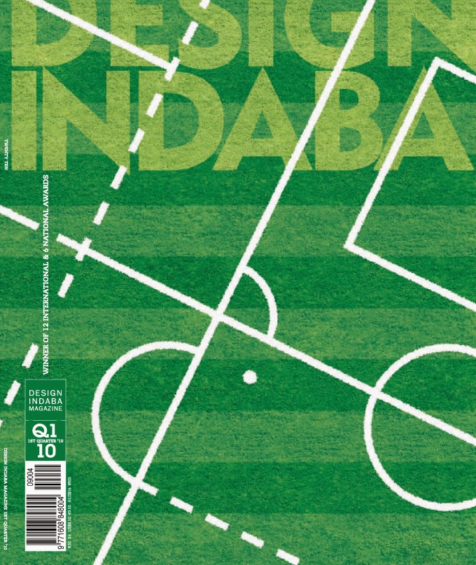
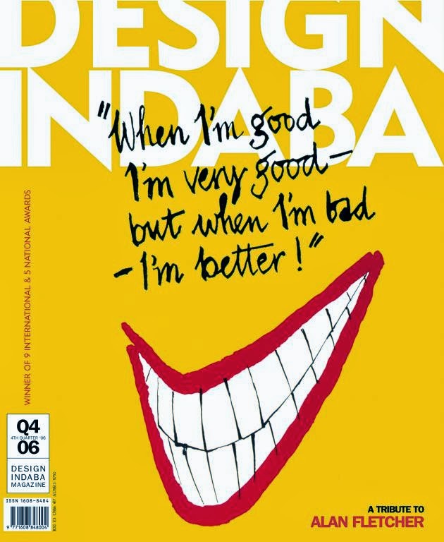
The Magazine we are going to look at is Design Indaba, now this magazine aimed strictly at creativity as designing includes one to have the ability to create something. The meaning of the word Indaba translates as news or concern depending on the content of the actual Xhosa or Zulu sentence in which it is used. Here one can see the word as either for the main aim for the magazine is targeted at not only those who study it and are in the profession but also by those who love art, design and visual concepts. The images below shows three of Design Indaba's cover pages for some of the issues published throughout the years. 

figure 1

 link
figure 2

 link
figure 3

In the images above we can see that the Design Indaba team takes the design principles very seriously by not adding too much information on the front cover of their magazines, the main ingredient for a good design is that less is more, that way everything is visual and the viewer does not have to struggle to look for some information. The design of their front cover consists of one unified element unlike other magazines which has different headlines on the cover page which are hard to read reason being that some even run on behind the model on the cover. Although for a design magazine, the logo is not heavily illustrated, it is just basic san-serif type with the letter "N" adjusted to have both an ascender and a descender.

figure 4

figure 5

figure 6

I know I said the Magazine did not give in all they had when it came to designing the name, but inside the magazine that is where all creativity explodes and aesthetic layouts are being experienced on, because unlike other magazines this one is aimed at the people who are about design and these layouts should somehow motivate the people which reads the magazine. This should not only look aesthetic but the feel of the magazine itself should remind a reader that it is a product of top-notch designers by using paper which is harder than the usual magazine and using glossy and matte inks where necessary. In figure 4 we see how the double spread is used to present an image and type that goes with it, in other magazines we would see that the space is full and this is because the more information they put out the better for them as a magazine, on this one it is all about making the design to own a page in the most beautiful way possible, the information is little and yet it is clear, the heading of the information is being played with in order to achieve the breath-taking presentation with text layered over one another to create a creative visual experience. Although in figure 5 we cannot see the whole word that is transformed out of the page, it is clear to make out that the whole heading reads: "Big in Brazil", I do not have a clue how the designer directed me to make that up without having to read the article but then again that is the whole point of design, it is giving the most information as possible by using as little elements as you can. And then "The Other 90%" placed in such elegant composition in figure 7 showing that no matter which words you put before which in a sentence, as long as the design is on point then the words will be read in an order they should be in when written by hand, I say written by hand because after seeing these I do not know about the person reading this blog but I would like to believe that design is a whole different tool.