Now one would ask themselves why are hardcopy magazines still being produced and published in these contemporary times because the ideas of saving trees are growing as many people are introduced to technology, having to subscribe to read an article on the internet, on your smart TV and even being able to read the whole magazine on your tablet, e-reader or smartphone. Technology is growing wildly and being more available to almost everyone everywhere than it ever was before, but well the thing with technology is that there is always something that needs to be improved in a certain device, all the elements taken to account such as the software, the hardware, and even the applications that run on a device will not always be perfect and run smoothly; some drains the battery, some causes glitches which may cause the device to operate more slowly or even jam and shut down uncontrollably. Therefore having to own a technological device then one must have the patience for all the odds which may be against you in t he future, and besides that having to own a device is not cheap, although one can save in order to have the money to buy one, having to maintain one will (in most cases) cost you more than the device's actual cost. It is therefore safer and cheaper to buy a magazine, not only that but in a magazine the people responsible for putting it together are the ones who decide how it should look and feel (we will look at this later), with the content shown on devices one would realize that not all the devices has the same visual feel when it comes to the content shown, for example a website may look clean and crisp on a HD TV(high definition television) and actually look bad on a tablet which does not support HD and have a low amount of ppi( pixels per inch).
The Magazine we are going to look at is Design Indaba, now this magazine aimed strictly at creativity as designing includes one to have the ability to create something. The meaning of the word Indaba translates as news or concern depending on the content of the actual Xhosa or Zulu sentence in which it is used. Here one can see the word as either for the main aim for the magazine is targeted at not only those who study it and are in the profession but also by those who love art, design and visual concepts. The images below shows three of Design Indaba's cover pages for some of the issues published throughout the years.

figure 1
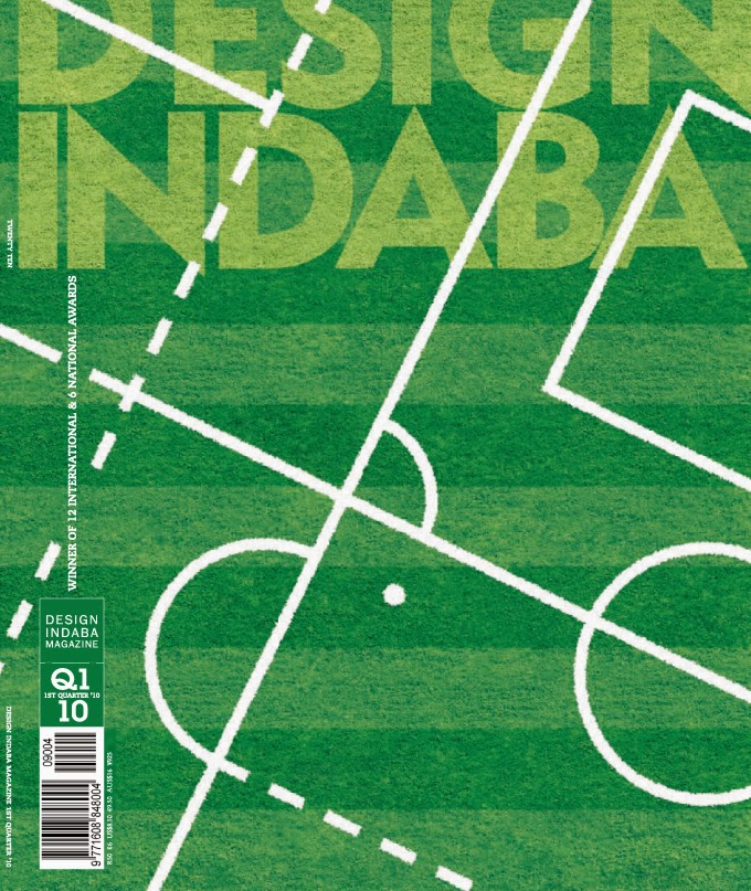
figure 2
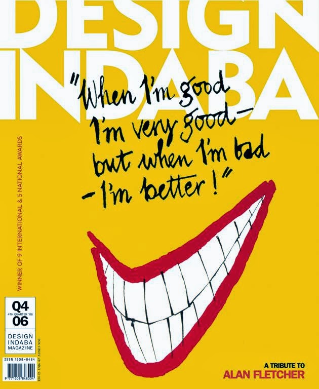
figure 3
In the images above we can see that the Design Indaba team takes the design principles very seriously by not adding too much information on the front cover of their magazines, the main ingredient for a good design is that less is more, that way everything is visual and the viewer does not have to struggle to look for some information. The design of their front cover consists of one unified element unlike other magazines which has different headlines on the cover page which are hard to read reason being that some even run on behind the model on the cover. Although for a design magazine, the logo is not heavily illustrated, it is just basic san-serif type with the letter "N" adjusted to have both an ascender and a descender.

figure 4

figure 5

figure 6
I know I said the Magazine did not give in all they had when it came to designing the name, but inside the magazine that is where all creativity explodes and aesthetic layouts are being experienced on, because unlike other magazines this one is aimed at the people who are about design and these layouts should somehow motivate the people which reads the magazine. This should not only look aesthetic but the feel of the magazine itself should remind a reader that it is a product of top-notch designers by using paper which is harder than the usual magazine and using glossy and matte inks where necessary. In figure 4 we see how the double spread is used to present an image and type that goes with it, in other magazines we would see that the space is full and this is because the more information they put out the better for them as a magazine, on this one it is all about making the design to own a page in the most beautiful way possible, the information is little and yet it is clear, the heading of the information is being played with in order to achieve the breath-taking presentation with text layered over one another to create a creative visual experience. Although in figure 5 we cannot see the whole word that is transformed out of the page, it is clear to make out that the whole heading reads: "Big in Brazil", I do not have a clue how the designer directed me to make that up without having to read the article but then again that is the whole point of design, it is giving the most information as possible by using as little elements as you can. And then "The Other 90%" placed in such elegant composition in figure 7 showing that no matter which words you put before which in a sentence, as long as the design is on point then the words will be read in an order they should be in when written by hand, I say written by hand because after seeing these I do not know about the person reading this blog but I would like to believe that design is a whole different tool.
No comments:
Post a Comment