Friday 8 August 2014

South African Subcultures: Kwaito

Kwaito is a South African music genre which begun during the 1990's in Johannesburg. This type of music stands out from the rest for its easy catchy lyrics and african sounds which are sung or rapped over a slow distinctive house melody consisting of deep bass lines and percussive loop samples. The style of the people who represent this genre is was so fashionable back in the 90's when it promoted the label Loxion Kulca(figure 1) , Dickies(figure 2) and Converse All Stars sneakers(figure 3).

Figure 1


Figure 2


Figure 3


Figure 4


People often compare the similarities between kwaito and hip hop whereas they are far different compliment each other to a point, kwaito is about living a simplified life and simplified lyrics, fashion and dancing and in hip hop it is about representing elements such as rap( rhythm and poetry), b-boying, skate boarding, grafitti and battle rap(cyphers where rappers come together and show their poetic skill against each other). Ofcourse today all these elements of both kwaito and hip hop may have crossed paths or even disappeared from the branch of a subcultures to become subcultures of their own. Today we have a music genre from the North West of South Africa named "Motswako", and this is basically a setswana version of kwaito and hip hop, which can be said to be venecular hip hop lyrics on kwaito beats or even hip hop beats, this type of style was given birth by kwaito music and is now a subculture on its own.

Links:
http://www.sahistory.org.za/performing-arts/kwaito#content-top
https://www.youtube.com/watch?v=ui3q2g55z3A
https://www.youtube.com/watch?v=Ph8_DyOnSbM

Digital Age


Links:
http://www.google.com/glass/start/
http://www.oculusvr.com/
http://www.android.com/wear/
blog.us.playstation.com/2014/03/18/introducing-project-morpheus/

Technocentricism of Postmodernity

Firstly the word "technocentricism' refers to technology being the centre of everything, and "postmodernity" is a late 20th century movement in the arts, architecture and criticism that was a departure from modernism. Therefore what Konik is saying is that basically we as humans of the postmodern world has become so centred to technology that most of the things we do today depends on technology, for example: in this assignment 1 blog entries we had options to either write all this information on an exercise book and hand it in for marking or we could use the internet and upload to a blog instead, well the option we chose is quite obvious, I mean we are the so-called generation X. Even our elders knows us as always staring on the screens of our cellphones, computers, and with smartwatches and technological glasses being on the developing stage at the moment one can say that we are never going back and will forever miss on the physical contact we used to experience with other people when growing up. Today we rely on technology for everything and this is because everything is online, from the answers to the question we have on our everyday lives, to the step to step tutorials about anything we need to do. Therefore Konik has a point by arguing that we are being dehumanized by technology through refering to a movie called Sonrezo's Pulse. 

Modernism and Postmodernism

The Modern and the Postmodern:
Contrasting Tendencies
The features in the table below are only often-discussed tendencies, not absolutes. In fact, the tendency to see things in seemingly obvious, binary, contrasting categories is usually associated with modernism. The tendency to dissolve binary categories and expose their arbitrary cultural co-dependency is associated with postmodernism. For heuristic purposes only.

Modernism/Modernity
Postmodern/Postmodernity 
Master Narratives and metanarratives of history, culture and national identity as accepted before WWII (American-European myths of progress). Myths of cultural and ethnic origin accepted as received.
Progress accepted as driving force behind history.
Suspicion and rejection of Master Narratives for history and culture; local narratives, ironic deconstruction of master narratives: counter-myths of origin.
"Progress" seen as a failed Master Narrative.
Faith in "Grand Theory" (totalizing explanations in history, science and culture) to represent all knowledge and explain everything.Rejection of totalizing theories; pursuit of localizing and contingent theories.
Faith in, and myths of, social and cultural unity, hierarchies of social-class and ethnic/national values, seemingly clear bases for unity.Social and cultural pluralism, disunity, unclear bases for social/national/ ethnic unity.
Master narrative of progress through science and technology.Skepticism of idea of progress, anti-technology reactions, neo-Luddism; new age religions.
Sense of unified, centered self; "individualism," unified identity.Sense of fragmentation and decentered self; multiple, conflicting identities.
Idea of "the family" as central unit of social order: model of the middle-class, nuclear family. Heterosexual norms.Alternative family units, alternatives to middle-class marriage model, multiple identities for couplings and childraising. Polysexuality, exposure of repressed homosexual and homosocial realities in cultures.
Hierarchy, order, centralized control.Subverted order, loss of centralized control, fragmentation.
Faith and personal investment in big politics (Nation-State, party).Trust and investment in micropolitics, identity politics, local politics, institutional power struggles.
Root/Depth tropes.
Faith in "Depth" (meaning, value, content, the signified) over "Surface" (appearances, the superficial, the signifier).
Rhizome/surface tropes.
Attention to play of surfaces, images, signifiers without concern for "Depth". Relational and horizontal differences, differentiations.
Crisis in representation and status of the image after photography and mass media.Culture adapting to simulation, visual media becoming undifferentiated equivalent forms, simulation and real-time media substituting for the real.
Faith in the "real" beyond media, language, symbols, and representations; authenticity of "originals."Hyper-reality, image saturation, simulacra seem more powerful than the "real"; images and texts with no prior "original".
"As seen on TV" and "as seen on MTV" are more powerful than unmediated experience.
Dichotomy of high and low culture (official vs. popular culture).
Imposed consensus that high or official culture is normative and authoritative, the ground of value and discrimination.
Disruption of the dominance of high culture by popular culture.
Mixing of popular and high cultures, new valuation of pop culture, hybrid cultural forms cancel "high"/"low" categories.
Mass culture, mass consumption, mass marketing.Demassified culture; niche products and marketing, smaller group identities.
Art as unique object and finished work authenticated by artist and validated by agreed upon standards.Art as process, performance, production, intertextuality.
Art as recycling of culture authenticated by audience and validated in subcultures sharing identity with the artist.  
Knowledge mastery, attempts to embrace a totality. Quest for interdisciplinary harmony.
Paradigms: The Library and The Encyclopedia.
Navigation through information overload, information management; fragmented, partial knowledge; just-in-time knowledge.
Paradigms: The Web.
Broadcast media, centralized one-to-many communications. Paradigms: broadcast networks and TV.Digital, interactive, client-server, distributed, user-motivated, individualized, many-to-many media. Paradigms: Internet file sharing, the Web and Web 2.0.
Centering/centeredness, centralized knowledge and authority.Dispersal, dissemination, networked, distributed knowledge.
Determinacy, dependence, hierarchy.Indeterminacy, contingency, polycentric power sources.
Seriousness of intention and purpose, middle-class earnestness.Play, irony, challenge to official seriousness, subversion of earnestness.
Sense of clear generic boundaries and wholeness (art, music, and literature).Hybridity, promiscuous genres, recombinant culture, intertextuality, pastiche.
Design and architecture of New York and Berlin.Design and architecture of LA and Las Vegas
Clear dichotomy between organic and inorganic, human and machine.Cyborgian mixing of organic and inorganic, human and machine and electronic.
Phallic ordering of sexual difference, unified sexualities, exclusion/bracketing of pornography.Androgyny, queer sexual identities, polymorphous sexuality, mass marketing of pornography, porn style mixing with mainstream images.
The book as sufficient bearer of the word.
The library as complete and total system for printed knowledge.
Hypermedia as transcendence of the physical limits of print media.
The Web as infinitely expandable, centerless, inter-connected information system.


Created by Martine Irvine
Link:
http://faculty.georgetown.edu/irvinem/theory/pomo.html

Benetton! Benetton! Benetton!

United Colours of Benetton has been known not for the colourful clothing they manufacture but rather for the controversial posters of theirs which they claim to have bring awareness of the things happening in the world towards the public. We will look at some of their posters throughout the years and comment on what changed and what stayed the same about the views and posters of the company found by the Italian Benetton family during 1965.

1982

1991


1993


1996


1997

2012


2013


2014


Looking at the images above one would realize that United Colours of Benetton never comprimizes when it comes to their  posters, they tell it like it is and this is on of the reasons that people see it as exploiting the people they use as models on their posters because they advertise the Benetton company with these posters instead of helping these people. It seems that the Benetton advertisements has become mild throughout the years as we can see in the most recent images of theirs above, either way, the company is being recognized by doing what no other company dared to do. Even to this day there is a history of their posters but only from about 3 years back, well the others could be absent because maybe, just maybe there is a limit on digital space for a website or could it be that they are too controversial maybe? 

“We did not create our advertisements in order to provoke, but to make people talk, to develop citizen consciousness,” Luciano Benetton assures us. - See more at: http://top10buzz.com/top-ten-controversial-united-colors-of-benetton-ads/#sthash.8egiyPTs.dpuf

Well I guess he achieved his goal because people are talking, and when people talk sometimes it is hard for them to stop. 

Links:
http://www.benettongroup.com/media-press/image-gallery/brand-campaigns
http://top10buzz.com/top-ten-controversial-united-colors-of-benetton-ads/

Wednesday 21 May 2014

South African Conceptual Design

There many styles, types and forms of art, which include the art movements which has been  developed and discovered throughout the history of art history, talking about all those styles in context would take up a lot of lifetimes therefore in this case we are only going to focus on one which is conceptual design. Conceptual art distinguishes itself from design for its ability to stand for something that is functional and by also illustrating design ideas which could potentially be functional. Before conceptual design text was illustrated to give the message to the viewer and often words and images were used to make sense of the design, conceptual design changed that by giving the artist or designer the freedom to use whatever they see as a canvas to use it to give out information using expressive ideas and concepts.  South Africa is one of the countries which has the media flooded with conceptual art of campaigns which raises awareness about the issues which has to be attended to in the country.

HERE ARE EXAMPLES OF THESE CAMPAIGNS USING CONCEPTUAL ART WHICH ARE LINKS TO THEIR SITES:


Figure 1

The image above is a poster about the Nelson Mandela Day which is about recognizing the good things that the icon has done for us and we dedicate this day to him and celebrating it by simply doing good things for those in need and wanting nothing in return. I see this poster as conceptual art for the fact that there is no image of Nelson Mandela in the poster, just the idea of him and one cannot actually tell that the person masked with text is facing to the back or to the front, because there is no recognizable face on the image  one can see the person as themselves as they help those they can just like Nelson decided to stand up not only for the black race but for equality in South Africa. The poster does not tell individuals what to do by encourages them to choose to do anything that they see as being a great idea for them. 

Figure 2

Another issue facing South Africa is the extinction of rhinos in the country and no matter how the security measures are upped in the country there are still hunters around the world which pose a threat for the animals. The Save the Rhino campaign is made for the recognition of the pouching of rhinos and how that endangers these animals and threatens their existence for they are not that many in the world. The image shows another animal with a rhino horn strapped on its face and uses the tagline "nothing will ever bring them back"emphasizing how different and weird the other animals would look to us if they had an extra feature which does not belong to them, this also gets one to think of how bad it would look for a rhino to miss a feature it is mostly known of possessing, the campaign's aims is to make the people aware of the corruption and cruelty against animals which take place and donate money to help stop this. 

   Figure 3

The image above titled figure 3 is by the South Africa Counter- `Trafficking Programme (SACTP) and it is a programme by the International Organisation of Migration (OIM) which is aiming to raise awareness and stop the act of human trafficking and protecting victims and potential victims of the crime. The poster reads "she can't ask for help" which is emphasized by the red marks covering her mouth and by seeing this one immediately gets the idea that the victims are not in a position to stand up for themselves, therefore it is up to the viewer to be aware of the crime and not only protect those who  are close to the person but also help in retrieving the victims of human trafficking and catching the people behind the crime. No one would want someone they care about get taken from them and no one wants their freedom to be taken from them.

I find that the conceptual image affects the emotions of the viewer more than commercial art where composition is used to make the art beautiful than thought through in presenting an idea. I find that in most cases conceptual art is used for serious issues which has to be taken care of and it used in  a way that it attracts the eyes of the viewers and yet reveals the idea of the unspoken reality which takes place. Although it can be used to express any idea, conceptual art is mostly used in raising awareness about issues which otherwise one would not feel right seeing the design advertising something else like Benetton used to do with his controversial ads.   

Monday 28 April 2014

The Importance of a Manifesto

Manifestos has been around for centuries until today and they have served people well, but the question is what is a manifesto and what purpose do they serve? I will answer that later as we look at a couple of manifestos including the "First Things First" manifesto as well as the "Incomplete Manifesto of Growth".

As I revealed above the idea of manifestos has been around for centuries shows that these specific types of documents served  some kind of an important purpose to the human history through years, these include the political ones, the technological, artistic, scientific and educational, but we will not discuss this deeper for in this case we are only focused on the artistic ones. The first artistic manifesto was launched in 1909 by Fillipo Tomasso Marinetti and was titled "The Futurist Manifesto" which explained and made more clear the ways of the Futurist artists and the value of their movement. The Oxford Leaner's dictionary defines the word 'manifest" as to show something clearly, especially a feeling, an attitude or quality, derived from that a manifesto is a written statement which  explains the beliefs of the people who are for the movement that the manifesto explains. The Futurist Manifesto was explaining how the art resembled the fast living of the city life, the sleeplessness, and the energy in every way possible, they did this through paintings, poetry and sculptures.

THE FOLLOWING HEADINGS ARE LINKED TO THEIR MANIFESTOS:

First Things First (2000)

The First Things First manifesto was written during the year 1964 by Graphic Designers declaring the importance and value of design arguing that it should not be overlooked, therefore designers should not use their imagination to make designs for companies exploiting their creativity to promote their products in order to sell. This argument was revisited by the year 2000 as Graphic Designers of that year also believed in the views of the manifesto and rewrote it to accommodate the what was the contemporary times by then, these designers also believed that designers should do work that matters as in for charitable causes and other information designs which urgently require their expertise. I agree with  these arguments, but then again I see design as I see Mathematics, the more one actually works in something the more experience and skillful they will get which will give them more skill to execute his or her creativity well with different mediums without reaching dead ends. Therefore although this manifesto argues facts by saying our worth as designers should not be used for what we do not believe in such as product marketing for it is merely promoting the company's name and products, but I see it as a challenge to a designer which at the end will show if a designer has the capability to do what is expected of him or her. Design is a career and as designers we should engage in as many project as possible, as long as we learn something from them and they help us to be more creative, I believe we should not limit our creativity according to a certain number of projects to work  on, we should use every opportunity we come across and use it to grow.

Incomplete Manifesto for Growth (Bruce Mau)

The Incomplete Manifesto for Growth I see more as a desiderata(things wanted or needed) for it is how many designers would want to be, it is steps that reveals the secret of growing as a designer in the art world, now no matter where one is in life I do not think there are those who are at a point where they do not want to grow, maybe in years but in mind and spirit everyone yearns that. As a Graphic Designer there are times where I would feel frustrated about a project and not know what to do because I do not have an idea to work from, therefore I would spent time stressing and wondering when will a piece of creativity fall from  the sky because in the design world time is literally money. This manifesto is about showing designers that they do not have to go through that, all they have to do is to enjoy what they do and test themselves with the projects they do while knowing that nothing is ever wrong, but something to learn from. One would decide to view this manifesto as something that is intending to build a perfect individual with the excuse of "no one is perfect" in mind, well the thing with this manifesto is that it is for growth and not for perfection, it does state that the things you would see as mistakes should not be seen as such for that type of perceiving will only block one from growing, this manifesto is about growth and there is no human which has reached a point where they can no longer grow.

De Stijl (1918)

The De Stijl group had a goal of an organic combination of architecture, sculpture and painting in a lucid, elemental, unsentimental construction. This group was interested in "pure reality", universal harmony, asymmetry, abstract reducing, geometry as well as vertical and horizontal lines. This pure reality which they mention means that their art was to be represented by the purest things as in primary colours(red, blue and yellow), and straight horizontal and vertical lines with  representations of only geometrical shapes. With this kind of art if there was no manifesto to explain its values people would have had overlooked it and saw it as something directed towards children and that right there is the importance of manifestos. De Stijl is truly art in its purest form with nothing abstract.

Without manifestos it would have been hard to understand the meaning of art, because unlike mathematics and science there is no one thing which describes it totally. Therefore manifestos has helped  in making the movement's pioneers message to be clear to the viewers and the listeners of art as they explain their visions and purpose of their art so that it would not be misinterpreted.


Wednesday 12 March 2014

Best Brands and Brand Names

We live in a world where almost everyone want to start their own businesses and brands because of the fact that people these days just do not see the purpose of working for someone else and coming with ideas which will make money for their employers instead of doing something which will benefit them by making that money for themselves. Well the thing is we all have the freedom and ideas to bring our names forward and even in the highest earning Forbes list if we are lucky enough to have all the odds in our favour,  something that stands in the way between us and achieving that success is that we all want to see ourselves there, what I am trying to say is that there will be people which will be always better at something you think you are good at and what you will envy is that some do it without even trying their best. Therefore one may have the best looking logo but it will always be a company out there which will have consumers lining up for their branded products even though your company offer an alternative and has a more meaningful name than the other. People often take care, personalize and put their names on the belongings which they feel good about, companies also has a way of showing that some products are offered by them and they do so by branding. Back in the 1950's Thomas Watson said "Good design is good business" and even today we can see people wanting to buy products owned by certain companies for the fact that those companies put a lot of money at markerting their brands in the most creative and entertaining way as possible.  The following are some brands which I as a graphic designer find very thought-through, elegant and having the ability to belong to any time period that is to come in the future.

figure 1

Adidas has been a brand which has recreations of their logo for long and yet all these logos are known to represent one company. The logo consists of three stripes in all the reproduction of it, what I have realized though is that the typeface used on the logo has never changed and it is also the main thing which causes people to recognize the brand even when it has different logos, so I would like to put the brand to the test by using just the typeface of the brand but in capital letters with the first "D" of the word facing the opposite way vertically in order to put emphasize of the three stripes as lines which go through the two "D"s and "I" to reproduce the three stripes but in a vertical stance.

figure 2

figure 3

Although there are words that the Blackberry company is doing bad at the moment because of Android, Iphone and Windows Phone giving it a tough competition in the smartphone world, I have to say that the above logo and name(figure 2  and figure 3) that RIM(Research In Motion) presented us with is one of a kind and is complemented by it logo for the fact that a blackberry fruit looks the same way and how their phones are produced with a beveled look and qwerty keyboard buttons also shows that the company put a lot of designing to achieve such. Figure 4 and figure 5 below shows how the B's of the name can be manipulated to make the logo. I do not think I would have 

figure 4

figure 5


Okay we now that we have seen about two of some of the best contemporary brands ever made in the history of conceptual corporate identity, now is time to see which is the third, I would like to bring forward that I did not know which one is best between the two so I picked them both to run in third place even though these are not brands are not against each other in any way (meaning there is no number one, two or three)and they are all good in different levels, Figure 6 is Firefox, the thing about this company is how they manipulated their logo to look like a fox which tail is fire seeming to run around the world, this internet launcher company presents how it is reliable in speed with just their logo, with respect I would not get an idea to better this if ever I am asked. Another is a Linux company using the South African philosophy of Ubuntu, which simply means "a person is a person through other people" and it is an open source computer software which means it can be downloaded or used for free without committing any fraud against the licenses as long as you do not sell it to others. Ubuntu uses a circle for their logo with outside smaller circles and if one looks closely they would see that it is actually three people holding hands in a circle, I would offer much change  to this as well but putting the small circular heads in align with something would do well for the logo and also make it easier for those who get fun in drawing or reproducing logos applying mathematics.

figure 6

figure 7


Tuesday 11 March 2014

Content and Style of Magazines; A Look Beyond the Words and Pictures

Now one would ask themselves why are hardcopy magazines still being produced and published in these contemporary times because the ideas of saving trees are growing as many people are introduced to technology, having to subscribe to read an article on the internet, on your smart TV and even being able to read the whole magazine on your tablet, e-reader or smartphone.  Technology is growing wildly and being more available to almost everyone everywhere than it ever was before, but well the thing with technology is that there is always something that needs to be improved in a certain device, all the elements taken to account such as the software, the hardware, and even the applications that run on a device will not always be perfect and run smoothly; some drains the battery, some causes glitches which may cause the device to operate more slowly or even jam and shut down uncontrollably. Therefore having to own a technological device then one must have the patience for all the odds which may be against you in t he future, and besides that having to own a device is not cheap, although one can save in order to have the money to buy one, having to maintain one will (in most cases) cost you more than the device's actual cost. It is therefore safer and cheaper to buy a magazine, not only that but in a magazine the people responsible for putting it together are the ones who decide how it should look and feel (we will look at this later), with the content shown on devices one would realize that not all the devices has the same visual feel when it comes to the content shown, for example a website may look clean and crisp on a HD TV(high definition television) and actually look bad on a tablet which does not support HD and have a low amount of ppi( pixels per inch). 

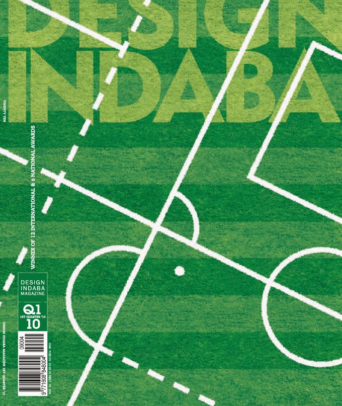
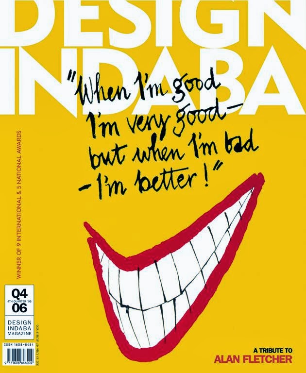
The Magazine we are going to look at is Design Indaba, now this magazine aimed strictly at creativity as designing includes one to have the ability to create something. The meaning of the word Indaba translates as news or concern depending on the content of the actual Xhosa or Zulu sentence in which it is used. Here one can see the word as either for the main aim for the magazine is targeted at not only those who study it and are in the profession but also by those who love art, design and visual concepts. The images below shows three of Design Indaba's cover pages for some of the issues published throughout the years. 

figure 1

 link
figure 2

 link
figure 3

In the images above we can see that the Design Indaba team takes the design principles very seriously by not adding too much information on the front cover of their magazines, the main ingredient for a good design is that less is more, that way everything is visual and the viewer does not have to struggle to look for some information. The design of their front cover consists of one unified element unlike other magazines which has different headlines on the cover page which are hard to read reason being that some even run on behind the model on the cover. Although for a design magazine, the logo is not heavily illustrated, it is just basic san-serif type with the letter "N" adjusted to have both an ascender and a descender.

figure 4

figure 5

figure 6

I know I said the Magazine did not give in all they had when it came to designing the name, but inside the magazine that is where all creativity explodes and aesthetic layouts are being experienced on, because unlike other magazines this one is aimed at the people who are about design and these layouts should somehow motivate the people which reads the magazine. This should not only look aesthetic but the feel of the magazine itself should remind a reader that it is a product of top-notch designers by using paper which is harder than the usual magazine and using glossy and matte inks where necessary. In figure 4 we see how the double spread is used to present an image and type that goes with it, in other magazines we would see that the space is full and this is because the more information they put out the better for them as a magazine, on this one it is all about making the design to own a page in the most beautiful way possible, the information is little and yet it is clear, the heading of the information is being played with in order to achieve the breath-taking presentation with text layered over one another to create a creative visual experience. Although in figure 5 we cannot see the whole word that is transformed out of the page, it is clear to make out that the whole heading reads: "Big in Brazil", I do not have a clue how the designer directed me to make that up without having to read the article but then again that is the whole point of design, it is giving the most information as possible by using as little elements as you can. And then "The Other 90%" placed in such elegant composition in figure 7 showing that no matter which words you put before which in a sentence, as long as the design is on point then the words will be read in an order they should be in when written by hand, I say written by hand because after seeing these I do not know about the person reading this blog but I would like to believe that design is a whole different tool.


Monday 24 February 2014

Contemporary brands that reflect International Typographic Style

The International Typographic Style is an art movement which took place during the 1950's in Switzerland and it is also called the Swiss style. This graphic design movement was developed in order to cleanliness of the typographic material in the design, readability and objectivity of the designs were  the main cause for the development of this style as it was seen that the art movements which came before this style had complicated concepts merged with the ornaments of the type and was therefore hard to read. A representation of this style can be seen in the elements used as in the asymmetric layout of the whole composition, the use of a grid in order to perfect straight lines and the position of the text and objects, the sans-serif typefaces and the flush left, ragged right text used in the composition.

The following are examples of the contemporary logos and brands which represent the principles of this particular graphic design movement:

THE FOLLOWING IMAGES ARE LINKED TO EITHER SITES OF ORIGIN OR SITES OF THE LOGO INFORMATION AND DESCRIPTION. 

figure 1: Google

 figure 2: Adidas

 figure 3: BMW


 figure 4: ebay


figure 5: Facebook


 figure 6: FedEx


figure 7: Microsoft


figure 8: LG

 figure 9: Yahoo


figure 10: Playstation 4


A logo is usually seen as the personality of the company and that is one of the reasons most companies have changed their logos and brands in order for the companies to stand relevant through the changing times, in this case companies will go lengths in order to make sure their logos as simple as possible because of the information age we are in there are smartphone applications for example and in order for third party theme software developers to accommodate applications such as "Facebook" they should have the ability to designs its logo from scratch. This is one reason the logos and brands of the companies should be in their simplest form and have a grid-based layout or formulae.  

THE FOLLOWING EXPLANATIONS OF THE LOGOS DOES NOT CORRESPOND WITH THE ABOVE FIGURES.

Figure 1: Google
Google is an internet web search-engine company which now is well known for all other projects it works on such as the Android software for mobile devices and other applications it offers, at first its logo may have been a simple typeface which it still is now but it had a bit "bevel" effect on it and a shadow which made the logo seem as if it is three-dimensional, they now took off those effects and went with the more clean type with the same colours but took off the effects which belonged in 2005.

Figure 2: Adidas
Adidas is a sport's clothing brand which is well known for its simplistic three lines of the same thickness, during this age when one is wearing a brand that has the same 3 lines and yet it is not manufactured by Adidas then one may be made fun of by his or her peers for supporting a line which "is trying" to mimic the original as the teenagers would say. Adidas may have different logos for one brand but at the end of the day one still recognizes that all the products belong to one company for the way they all complement the brand.

Figure 3: BMW
BMW is a car manufacturer which is well known for its upper-class material and safety measures it takes to account for its customers to be safe in the road with their vehicles. The reason I chose their logo as one of the logos which reflect the Swiss style is because they are one of the companies which use circles on their logos, now as a graphic designer I assume most of us has tried to hand draw a circle and realize that no matter how accurate it seems to be, it is not. One needs two intersecting lines in order to draw a circle but in editing the circle to become something like what BMW has done then a grid will be needed for the design to be asymmetrical.

Here is an example of a logo containing circles:

Figure 4: Yahoo
Yahoo is also an online search engine as Google, but as I know from my peers it was mostly known for its electronic mail services and was less used as a search engine. Yahoo has went places with its logo changing it from time to time in order to match the contemporary simplistic style of following the Swiss design.


Just as the Figure 4: ebay above Yahoo first had a logo which was not aligned well and was more funky, now they changed it to look more professional. Although the first logo was sans-serif, Yahoo changed it on the latest and yet kept the aesthetic of the brand with clean typeface used in the new logo.

Figure 5: Playstation 4
Playstation is a company which manufactures game consoles and their softwares, the consoles come out as a new brand and a different logo with each device they put out, this includes the Playstation 1, Playstation 2, Playstation Portable, Playstation 3, PS Vita, and Playstation 4. With this kind of technology the game developers for the gaming  consoles has to show which console is able to play a specific game as not all of them can read the same disk games, each has its own set of titles and therefore the game developers has to show the logo of the device on the disk/ game title it is for in order  for owners of different consoles to know whether the game is compatible with their devices or not. The PS4 logo above shows symmetry with the left and right balance of the type and PS logo, the PS4 type was designed on a grid though the corners are perfectly round-shaped could be to portray the smoothness of the gameplay as one of the pioneers of the movement of the International Typographic Style Ernest Keller said that what you portray something should influence how you portray it.